Overview
Ratings
Product details
Recommendations
৳ 376
৳ 450
-16%
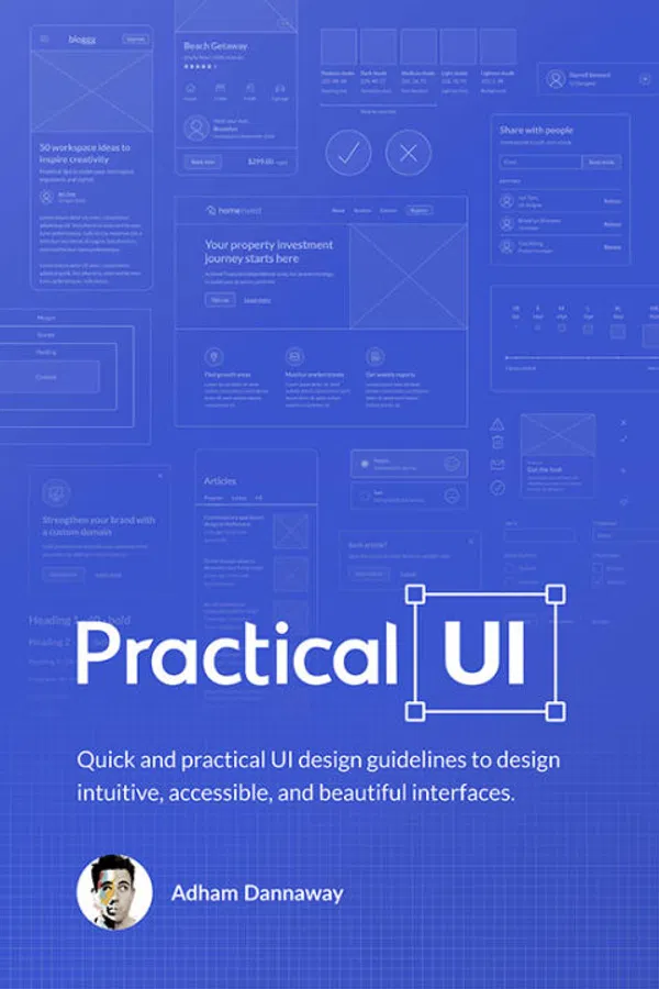
Practical UI by Adham Dannaway
4
(1)
Product Options
Specifications
Brand,ISBN/ISSN
Service
service
14 days easy return
Change of mind is not applicable
service
Warranty not available
Ratings and Reviews (1)
View All
Shimanto -
Book is Black and White, Kichu page totally black, Color hole Valo hoto. but Overall readable.
Questions about this product (0)
There are no questions yet.
ask the seller now and their answer will show here.
ask questions
Neuron Book collection
Neuron Book collection
Follow
80%
Positive Seller Ratings
100%
Ship on Time
Not enough data
Chat Response Rate
Visit Store
Highlights
Learn a logic-driven approach to design intuitive, accessible, and beautiful interfaces using quick and practical guidelines.
Interface design is hard. Having endless design possibilities sounds great in theory, but in practice, it can be frustrating and time consuming. With so many options to choose from regarding layout, spacing, typography, and colour, making design decisions can be overwhelming. When you add usability, accessibility, and psychology to the mix, it gets even harder.
Luckily, UI design doesn’t have to be so hard. Over the years, I’ve realised that most of my UI design decisions are governed by a system of logical guidelines. Not artistic flair or magical intuition, just simple guidelines.
Sure, artistic talent helps, but a lot of what makes up an intuitive, accessible, and beautiful interface design can be learned. Having a system of logical guidelines helps you efficiently make informed design decisions. Without a logical system, you’re just using gut feeling to move stuff around until it
looks pretty.
I wish I knew these guidelines when I first started out. They're a culmination of nearly 2 decades working as a product designer on websites and apps used by millions of people. My hope is that they’ll help you gain years of experience in a matter of hours.
Description
Learn a logic-driven approach to design intuitive, accessible, and beautiful interfaces using quick and practical guidelines.
Interface design is hard. Having endless design possibilities sounds great in theory, but in practice, it can be frustrating and time consuming. With so many options to choose from regarding layout, spacing, typography, and colour, making design decisions can be overwhelming. When you add usability, accessibility, and psychology to the mix, it gets even harder.
Luckily, UI design doesn’t have to be so hard. Over the years, I’ve realised that most of my UI design decisions are governed by a system of logical guidelines. Not artistic flair or magical intuition, just simple guidelines.
Sure, artistic talent helps, but a lot of what makes up an intuitive, accessible, and beautiful interface design can be learned. Having a system of logical guidelines helps you efficiently make informed design decisions. Without a logical system, you’re just using gut feeling to move stuff around until it
looks pretty.
I wish I knew these guidelines when I first started out. They're a culmination of nearly 2 decades working as a product designer on websites and apps used by millions of people. My hope is that they’ll help you gain years of experience in a matter of hours.